Visual Identity
Client: UNBOXED Foundation
2021
UNBOXED is here for the youth of today, to support their expression of gender, sexuality and diversity. The new visual identity is bright, fresh and very playful. We played around with colour and type in order to come up with an experimental new visual style. We decided to have fun, let loose and experiment. Because that’s what life is all about.
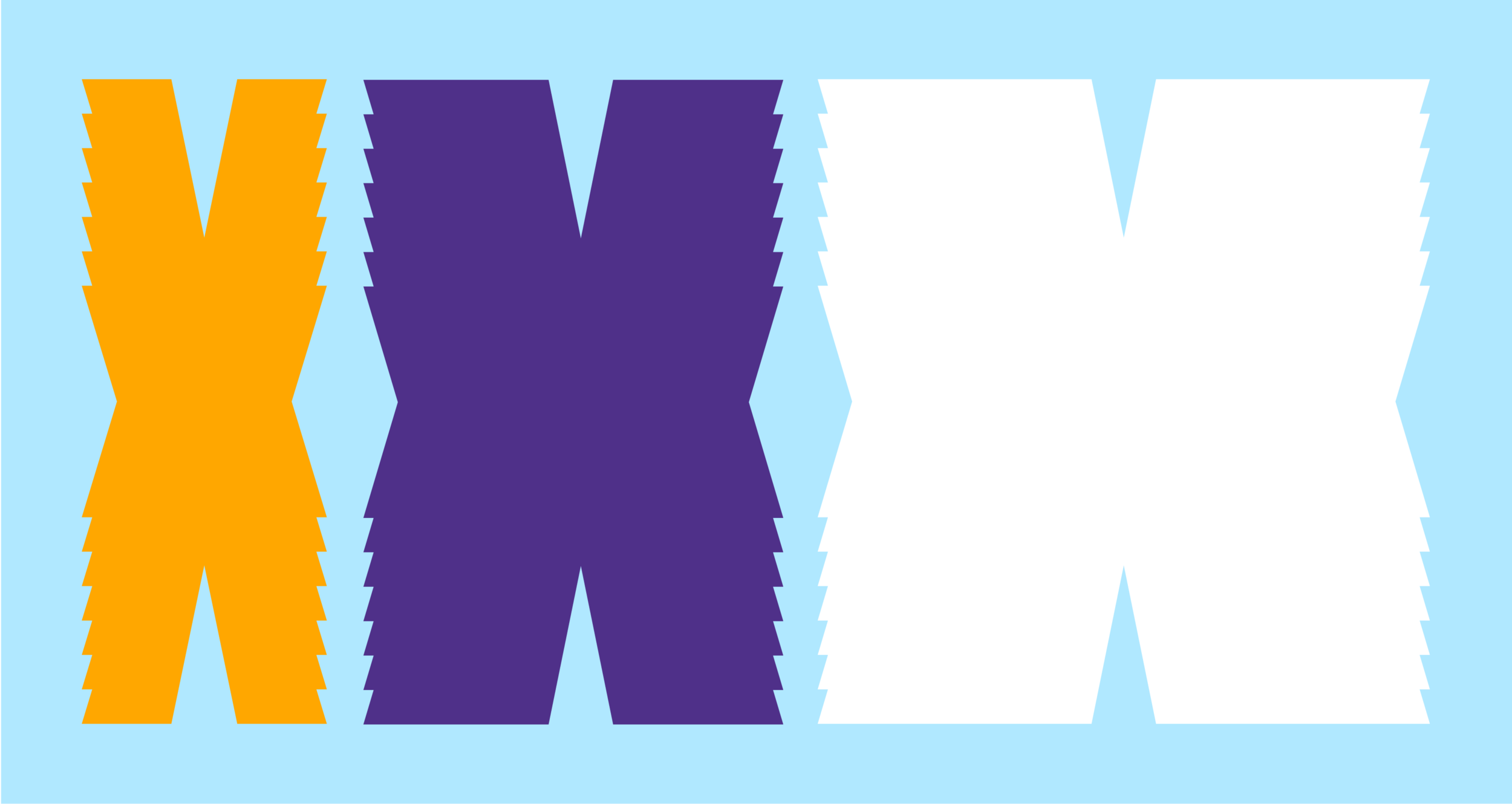
An important part of the identity is the bespoke typeface that is use for the word logo. The concept for the typeface is bold and playful and it is meant to make you smile - but also to communicate strong and powerful messages. To serve both purposes we experimented with existing letters and added shapes and volume to find the exact right balance. When stretched and pulled the individual letters suggest flexibility and movement, made to mimic the way the youth of today expresses their identity and gender.
Another part of the visual identity is a set of flexible design assets that can be used in whatever needs to be designed. Diversity is one of the key values of UNBOXED and we wanted to incorporate that in the visual identity as well. The design assets can be used in different colours and combinations and they accompany the (word)logo in compositions for all sorts of designs.
Take a look at the website here.